Type
Brand identity / AI production
client
Self-directed
role
Brand identity, art direction, AI production
year

The Brief
Feltwork is a somatic wellness community in Asheville, North Carolina, a city with one of the densest concentrations of breathwork, ecstatic dance and mind-body practitioners in the American South.
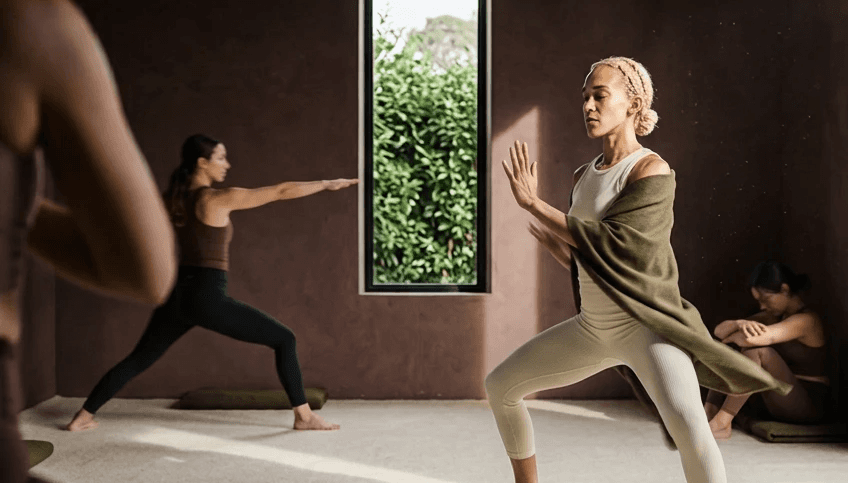
Five rooms. Sauna, cold plunge, meditation, art therapy, ecstatic dance. Two halves, body and mind, and the identity had to hold both without choosing one.
The audience already moves. What they lack is a practice that meets them where they are: overstimulated, under-recovered, and sceptical of anything that feels like performance. Transformation language fails here. Before and after, burn, results. Wrong register for people who are not trying to change, only to settle.
The brand runs on one idea: movement as regulation. Casting, light, colour and pacing all communicate nervous system safety rather than effort. The hook leads with the state the audience already knows, the fatigue under the surface, not the problem they would admit out loud.
Nothing to perform.
Identity
The category runs on serif, script and lotus. None of it is here.

Lowercase, set in Mulish, with the weight dropping across the word from heavy to light. It reads as something settling.
The core hypothesis is that audience doesn't respond to transformation language. "Before/after," "burn," "results" — all wrong register.
Six natual colours, every one achievable with natural dye. The 7th color is an accent for the app and doesn't cross into the physical space.
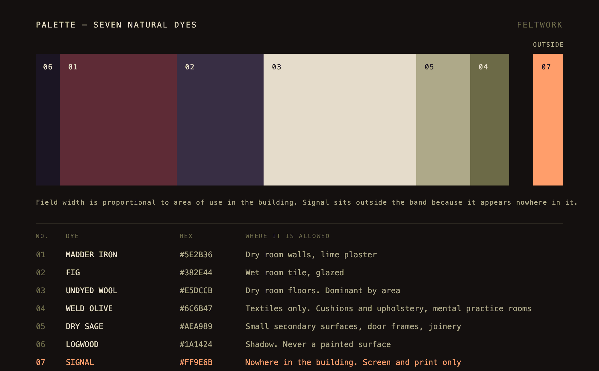
Deep burgundy plaster, violet-plum tile, undyed cream wool, muted olive. Deliberately off-palette for the category, because the standard wellness feed is white and sage. This reads as a different kind of place before anyone reads a word.
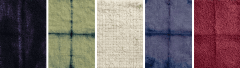
Each room carries one material and one light condition. What the room looks like tells you which half of the programme it is: wool color only in the body rooms, olive layered over it in the mind rooms, fig in wet rooms.
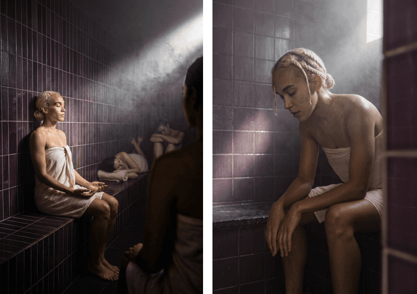
Two axes per room. One constant, one chosen for the space.
Solo against group is constant everywhere. The second axis changes, because intensity is not legible the same way in a sauna and a meditation room. Running an identical grid in every space would be a template. Choosing what each room tests is art direction.
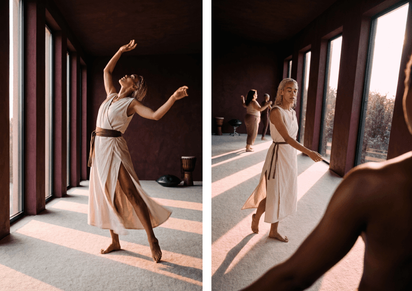
Solo frames sell privacy and control. Group frames sell belonging.
A membership in a city this dense with practitioners is more likely bought for the room than the equipment. But the two segments buy for opposite reasons, and one creative cannot serve both. Same room, same light, same lens, same camera position in all four. Only the pose and the number of people change, so the result is attributable to the variable rather than to the render.
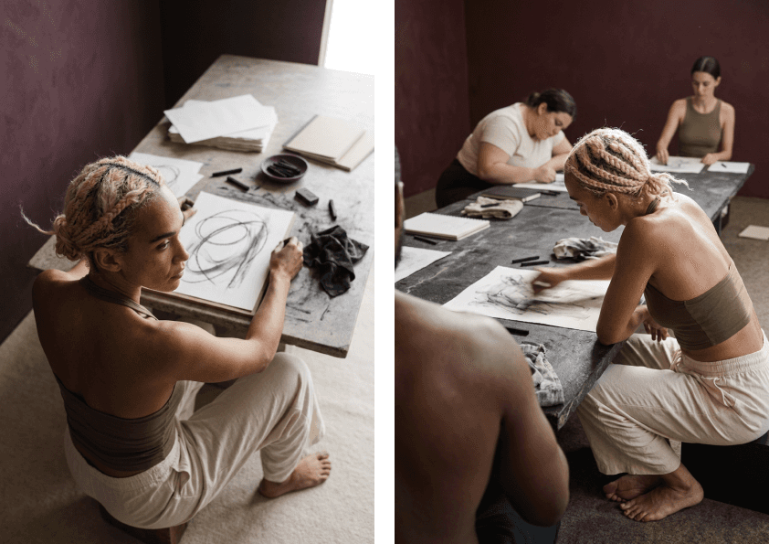
The category defaults to calm, and calm is invisible in a feed. The intense variants test whether visible physical load holds attention without importing the language this audience rejects.
Production and Testing
A brand like this needs a lot of images. Five rooms, two programme halves, solo and group, and enough variation per room to find out which version people respond to. Shooting it is a studio day per room and a model on retainer.
Generating it is cheap and usually unusable. The same person will not survive four images in a row. Ask for the same room twice and you get two rooms.
So the work was building a set of locks that hold a person, a room and a light across a full grid, so the only thing that changes is the thing being tested.

These are people who already move regularly. What they're missing is a practice that meets them where they actually are: overstimulated, under-recovered, and skeptical of anything that feels like performance.
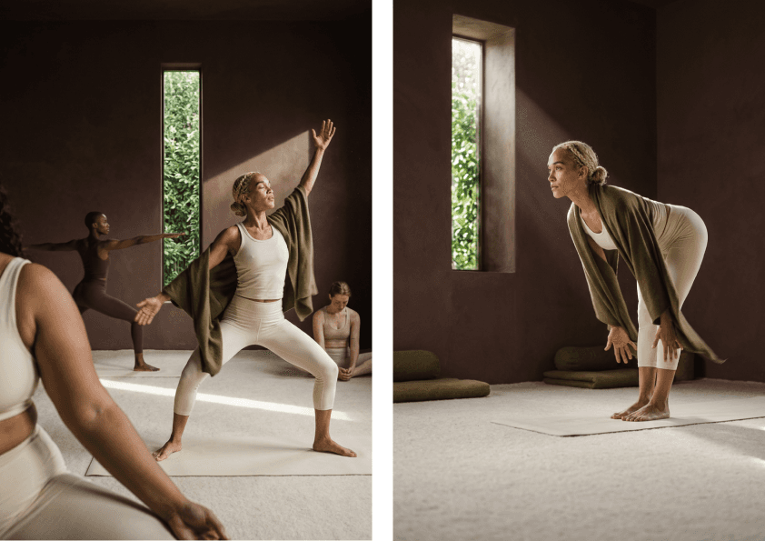
The campaign was built around one idea: movement as regulation, not output. Every creative decision — casting, lighting, color, pacing — was designed to communicate nervous system safety rather than effort.